I have always had a soft spot for all things Peruvian, having spent part of my childhood there. So when Ron Millonario — a true gem from Peru — approached us, I was genuinely thrilled and invested a lot of personal energy into the project. Seeing a Peruvian spirit rise to the level of Super Premium is rather unique as Millonario is a true tribute to quality and to the richness of its homeland.
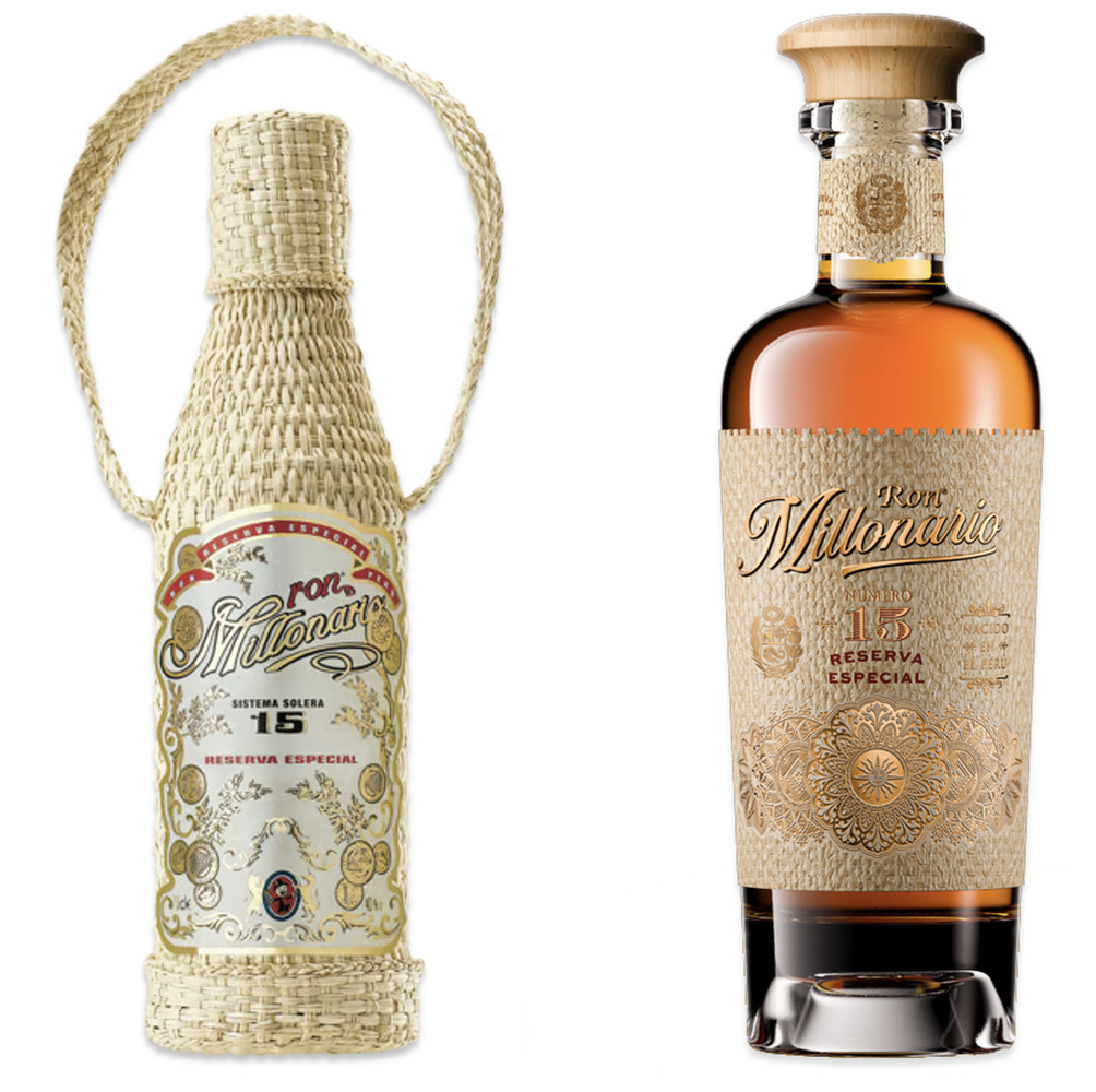
The journey to Millonario’s current evolution began with a practical challenge. The brand’s iconic Reserva Especial Número 15, wrapped in its hand‑woven straw sleeve, had become difficult to produce at scale and no longer fully conveyed the level of quality the liquid deserved. This sparked a complete brand immersion and positioning exercise with the brand team in 2023. Our goal was to give Millonario a clear, compelling direction to guide all future developments with Think Bold Studio — from packaging and product to communication.
A central task was to refresh the connection to the name “Millonario.” We defined a positioning that captures the brand’s rich spirit anchored in three core values: Affluence, Radiance, and Provenance, easily supported by the brand’s deep Peruvian roots: its exceptional sugarcane, its nearly 100‑year‑old column still in Chiclayo, and its unique sea‑level maturation, which gives the rum its mellow, indulgent character. This positioning became the foundation for a refreshed identity and a packaging system that reflects both substance and style.
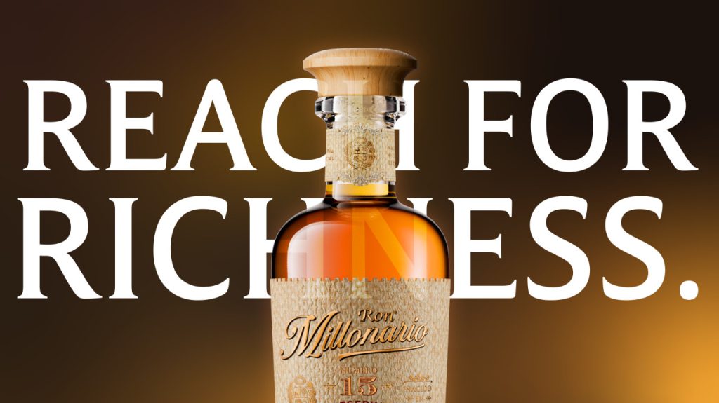
The revamp of Reserva Especial Número 15 was the first expression of this new vision. The new pack features a confident tapered bottle, a streamlined and bolder logotype, and rich decorative details inspired by Peru’s visual heritage — sun motifs, circular Inca‑style geometries, and fine barroco gold accents. A highlight of the redesign is the use of embossed tactile paper inspired by woven straw, an innovative approach which preserves the artisanal feel of the original hand‑woven sleeve while offering a premium, production‑friendly solution. Together, glass, liquid, wood tones, and straw‑like textures create a multi‑sensory experience that reflects the richness of Millonario inside and out.
To accompany the refresh, we enhanced the storytelling through a digital campaign. Centered on the Signature line “Reach for Richness”, the campaign was deliberately copy‑oriented to connect the new design with the brand’s essence. We produced nine short “story vignettes” highlighting individual elements of the pack — from the embossed straw texture to the sun emblem and the gold geometries — each paired with a concise story linking design, provenance, and status moments.
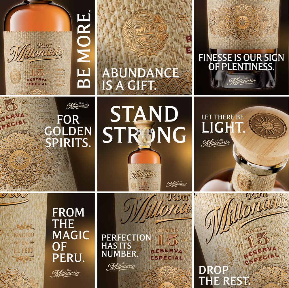
The sequence concluded with a Signature Vignette carrying the call to action, creating a strong rhythm and encouraging engagement. This scroll‑stopping approach, deployed on Social Media and events in English, French, and German, allowed to convey quality, heritage, and emotional appeal in just a few seconds, with impact and character.
This identity is now being extended to the rest of the Millonario range, but the revamp of Reserva Número 15 has already made a significant leap in positioning, perceived value, and international readiness. By leaning into its Peruvian provenance, celebrating the richness of its flavors, and expressing the bright, positive side of achievements, Ron Millonario is steadily building momentum in markets around the world. It is a brand with real heart, deep roots, and the radiance to shine far beyond its origin. [email protected]