or… how the MurLarkey Spirits packaging became a storytelling playground.
When Strategy Meets Shelf
With the brand platform in place, the next challenge was execution – particularly across packaging. This is where positioning either comes to life… or dies. And with MurLarkey’s ambitions, the packaging has to work hard. (Tip to any strategists out there : every advice MUST become tangible – otherwise it’s a self pleasing exercise).
We made a clear brief: refresh the full portfolio, increase perceived value, and create a system that unifies but still allows character and quirk. And do it while preserving the warmth, playfulness, and togetherness at the brand’s heart.
The “Gallery of Fantastic Friends”
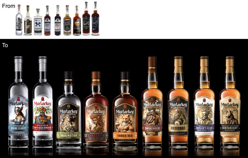
The breakthrough came from the observation that some existing labels—like Divine Clarity or Brutality—already featured expressive characters. That’s when we had this “aha” moment: what if every MurLarkey product became a character? A misfit, a muse, a cousin, a friend?
The idea of a Gallery of Fantastic Friends was born.
Each variant would be personified through illustration—a divine or mythical being, inspired by folklore, family dynamics, and the brand’s mix of Irish and Virginian roots. For instance:
- Divine Clarity became an angel with a torch, illuminating truth.
- Salsa Borracha became a portrait of “Papi” made of vegetables (a tribute to both flavor and whimsy).
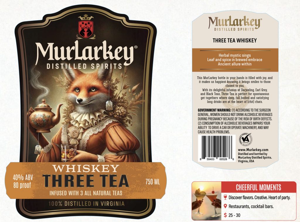
- Three Tea drew from a suave and quirky Fox Victorian lady.
- Smokehouse took the form of an infernal blacksmith / BBQ lover…
- Birthright incarnated in a Stag Dandy covered with medals because – I forgot to mention – Murlarkey is a REAL gold awards collector ! And so on…
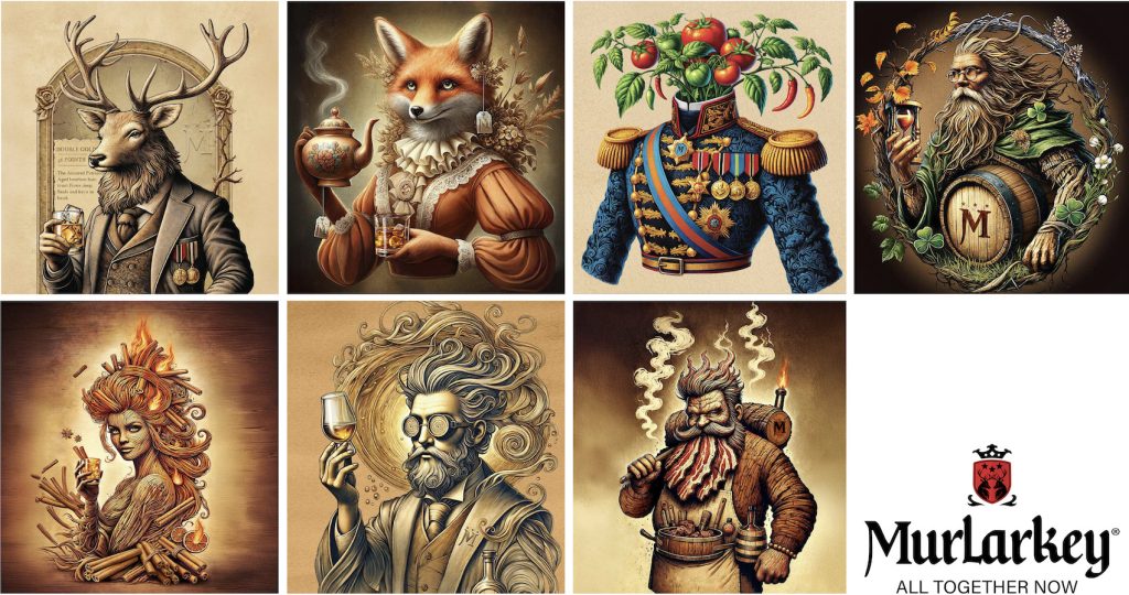
This approach allowed for limitless creativity while staying true to a central idea: spirits made for people with spirit.
Designing a Coherent System
We didn’t stop at illustrations. The full label system was reimagined:
- A simplified bottle range, with form factor in line with the respective category and finish signaling price tier.
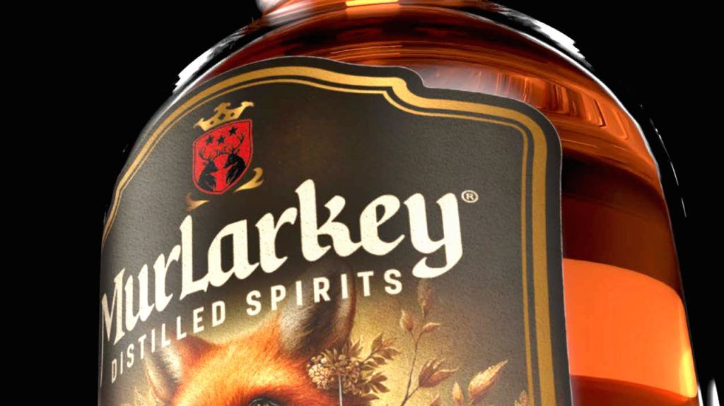
- Label shapes evoking shields or portraits, hinting at character and heritage.
- Typography that mixed tradition with clarity, and a redrawn “M” monogram for use across applications and merchandising – another important business source.
The result is a range that is distinctive, premium, and unmistakably MurLarkey. It feels hand-crafted but not rustic. Elevated but not elitist.
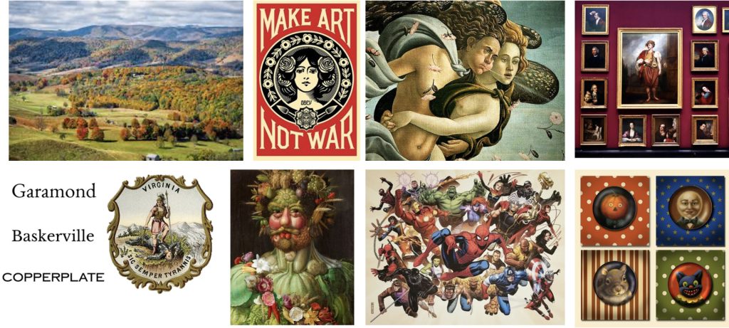
Another key semiotic decision: anchoring the brand in Virginia, not just Irish heritage from m where the Murray, Larkins and Kelly came from. While the name has a Celtic flair, the design system incorporates warm American tones, botanical references, and a hint of leprechaun.
This shift gives MurLarkey a clear place on shelf—and makes it exportable beyond its home state.
The new packaging launched in January 2025 alongside the opening of the Manassas campus. A bold move, yes. But one that paid off. The range now looks unified, tells stories, and invites consumers into the brand world. The next step? Making sure people hear about it. [email protected]