Every brand creation carries high hopes and dreams, but also its share of doubts in front of endless creative choices. At Brand Reveal, we believe the consistency accross brand elements is one of the ingredients for success. We call this the “Brand Beacon”. Read here how we worked with the Quinta Vale Santa Luzia, a new brand from the Douro Valley to find and express its beacon.
A “beacon” can be imagined as a “ray of light” which guides into the night, i.e. finding the proposition that will help align all the functional and emotional aspects of the brand. In 2021 Vicente Faria approached us to create a wine brand, Quinta Vale Santa Luzia which then had “only” the name and the estate in the Douro. We write “only” because to many this may not seem a lot, but is enough to spark some “beacons” – if one knows how to do it. To proceed, a three stages project was developed :
1 – Information Phase
This first phase takes many names (audit, deep dive, observation…), but the idea is simply to gather and summarise as much information as possible on the brand. This is like a forensic work where every story, event, symbol, product element, or production peculiarity is deeply examined. This takes the form of visits to the Estate, researching genealogies, interviewing former employees, digging out archives, opening doors… Once, a client of ours compared this Information Phase to “lying down at the psychologist”.

For Quinta Vale Santa Luzia, we spent time at the estate up in the Douro, spoke with the winemaker, some old-timers, visited all the buildings of the property (including ruins), collected old certificates, ownerships, dug into the symbology of the Saint who gave the name to the estate, reconstructed the different phases of the property in its two and a half centuries of existence…
2 – Positioning Phase
Equipped with a strong body of information, we then proceeded to the second stage of the project with the brand team: Positioning. In this phase, we build together all the elements that define the brand, i.e. its core values, personality, functional and emotional benefits, facts & symbols, and reasons to believe which culminate in the “Brand Promise”. Our role in this phase is to guide conversations and connect the dots between all elements to start revealing the Brand Beacon.

For Quinta Vale Santa Luzia, the Saint idea became very quickly the beacon we were looking for. Indeed, Santa Luzia is a saint who lived in the 4th century in Syracusa : she is the patron of light and vision (Luzia = Lux = Light).
This association matches the brand’s will to “celebrate everyone’s brilliant side through a beautiful range of premium wines created by Vicente Faria.
At the core of the brand, the values of Honesty, Vitality, and Perseverance sum up the principles tha brand and resonate with consumers who want to explore new quality wines in their celebration moments.
3 – Creation Phase
The third and last stage before launch is the Creation, i.e. bring to life all the graphic and physical elements of the brand. Our role is to accompany the client and the design agency to ensure that the creative propositions reflect the brand positioning, i.e are “on strategy”. The work here is to prepare the brief and make sure the designers are extremely inspired within the expression universe of the brand.

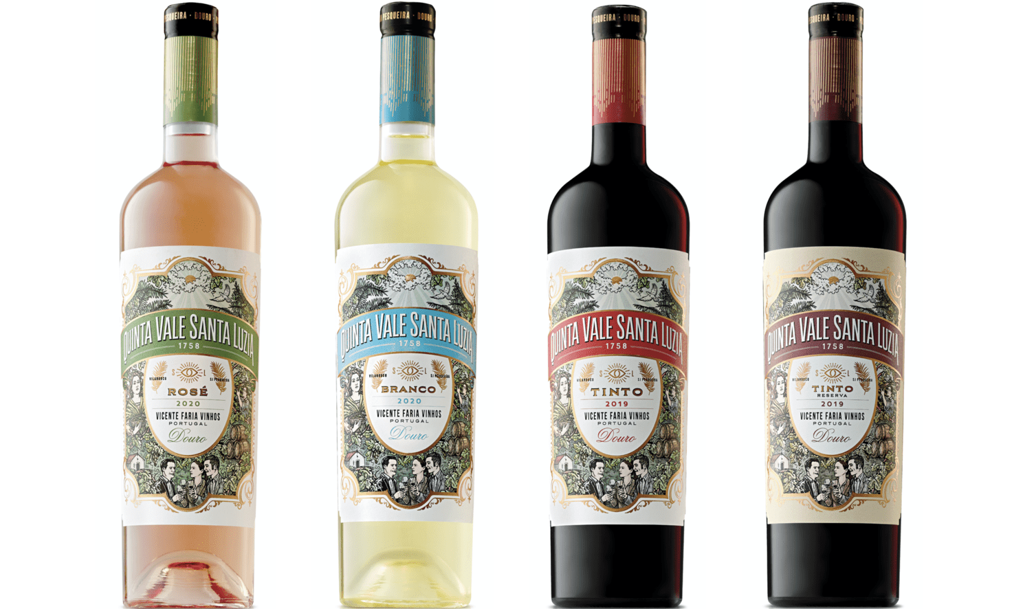
For Quinta Vale Santa Luzia, Vicente Faria appointed Calcco, a Spanish design agency with a beautiful flair for premium and classic-with-a-twist creativity. To bring to life the bright side of the brand, we opted for colourful labels and a rococo style full which glorifies the Quinta life – in full contrast to many Douro wines who adopt a very discreet, monochromatic, and typographic language.

The creation phase was a breeze in itself as the “beacon” inspired our preferences and guided fresh ideas. The result is a very rich and vibrant label range where every aspect, every letter, every shape play a role and have a symbology element, like the elliptic shape of the label which is reminiscent of an eye…
Overall the creation of the Quinta Vale Santa Luzia elements were pleasing because we spent quality time in defining the brand proposition, i.e. the “beacon”, which then allowed to incorporate symbols, elements and messages, and therefore build a body of consistent brand elements.

