How a Virginia spirits brand found its voice, the story of how we helped a young Craft spirit unlock growth. In the beginning…
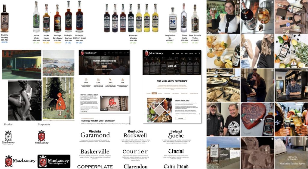
In the beginning, You don’t always know what you’re getting into when a new project begins. When MurLarkey Spirits reached out—together with their design partners Think Bold Studio – it seemed like a case of a craft brand with a big name stretched across multiple spirit categories. Vodka, gin, flavored whiskey, bourbon… all under one roof.
As a strategist, I’ve always been skeptical of this architecture. Most brands work best when rooted in specific category conventions and occasions. But MurLarkey didn’t follow the rules. And maybe that was the point. So, what if I could break the curse of the cross category brand? That, as a strategist is very exciting.
Starting With Candor
The team had grown the brand organically since 2019, building it pack by pack, with a mix of charm and chaos. By 2024, they felt it was time for coherence – and elevation (in their own word). Not just prettier bottles, but also clearer purpose, especially with a new distillery and brand home opening in Manassas.
So we dug in. With open minds and honest conversations, we audited the packaging, studied the market, reviewed occasions, and looked closely at what made MurLarkey, its Irish roots and Virginia – distinctive. To the credit of the team there was no defensiveness. Just curiosity and ambition. A big plus.
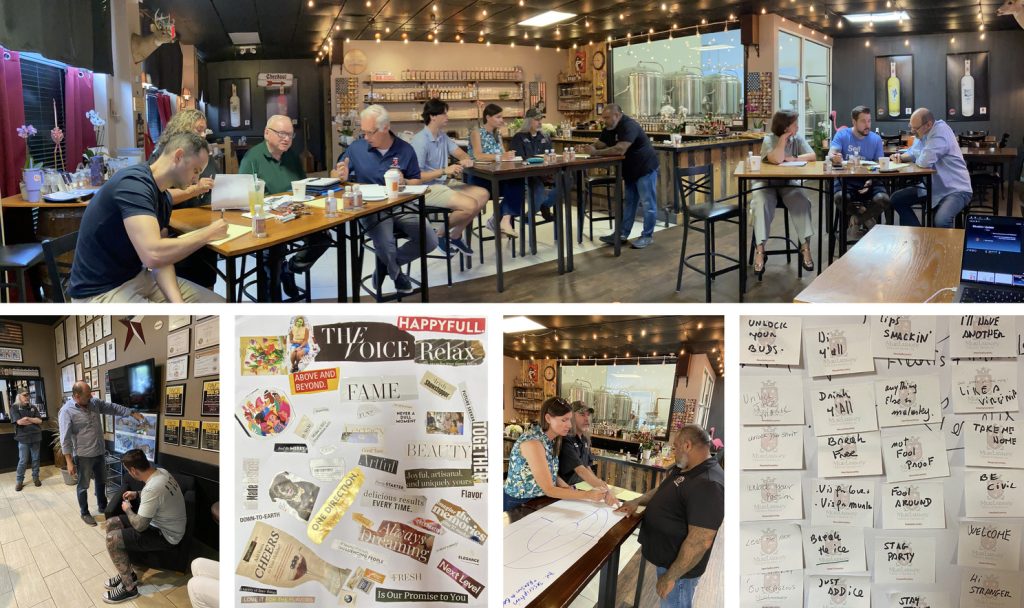
The Bristow Workshop.
So last August, we brought the full team together for two days in Bristow. The goal? Rebuild the brand from the inside out. We examined MurLarkey through multiple lenses – product truths, flavour style, emotional resonance, competitive space, consumer expectations – and began shaping what would become today’s brand platform.
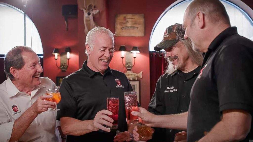
We talked values, personality, semiotics. We visited ABC stores and restaurants. We brainstormed and laughed a lot. And slowly, we uncovered the essence that had always been there, but never named: MurLarkey crafts joy.
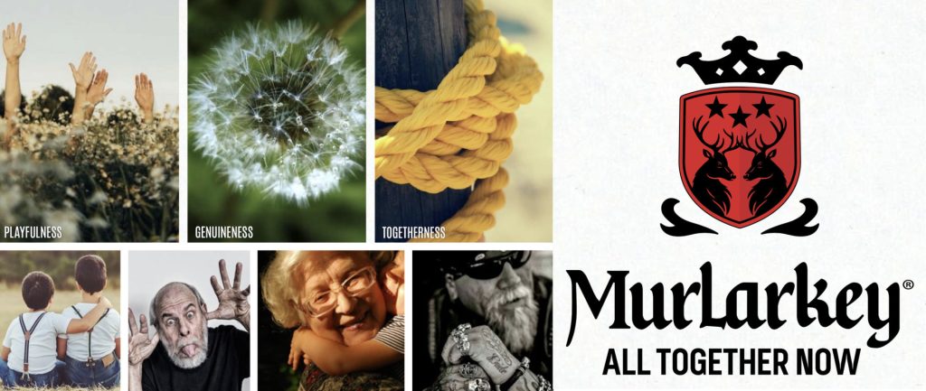
It was simple, true, and powerful. The brand is not about elitism or reverence. It was about genuine, spirited moments with friends and family. Togetherness, warmth, and a little mischief.
From Essence to Expression.
With this promise in hand, everything started to align. We refined the logo—making the twin stags more distinctive and friendly. We explored voice and tone, ultimately landing on the rallying cry (after more than one hundred copies!) : All together now.
A call to action that speaks to the brand’s Irish-American roots, its collective spirit, and the conviviality it wants to share. It’s not just a line. It’s a filter for every creative brief and business decision.
What Made It Work. This wasn’t a theoretical brand platform. It was built hand-in-hand with the founders, designers, and marketers. The ambition was real. The collaboration, open. And it set the stage for something bigger: not just a new identity, but a full portfolio relaunch.
That’s where the next story begins…