
In 2021, Vicente Faria Vinhos launched Quinta Vale Santa Luzia, a new Douro wine Brand. At the time, we only had the name—but a name with deep potential. Santa Luzia, the saint of light and vision, offered a world of symbolism to explore. Brand Reveal task was to craft a brand that not only spoke of heritage but also felt alive in today’s world, resonating with a new generation of quality wine enthusiasts.
We envisioned a brand that would be premium, aspirational, and distinctive within the crowded landscape of (Douro) wines. Our audience is the “Explorador Confiante”—adults in their 30s and 40s, socially active, curious about wine, and eager to bring something meaningful and beautiful to the table. To reach them, the packaging had to signal quality while also standing out with personality.
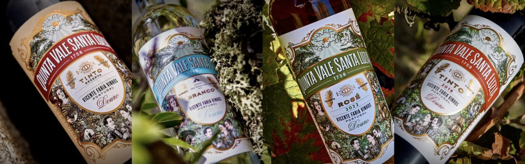
Instead of the conventional, typical labels of the region, we embraced a rich, graphic, and colorful visual language. Inspired by the story of Santa Luzia and the luminous promise of the brand, we created a world of celebration and brilliance: intricate illustrations, golden ornaments, and storytelling vignettes that felt classic yet vibrant. The ornate semiotics—serif typography, baroque framing, and detailed imagery—speak directly to the premium tier, promising depth, authenticity, and social recognition. In essence, each bottle of Quinta Vale Santa Luzia almost became a small piece of theater, ready to elevate (semi) formal occasions with style.
Two years later, the brand was ready to expand into more accessible price points—but we didn’t want to simply make a “lesser” version of the original. Instead, we created something with its own character, designed to attract younger, more spontaneous wine drinkers: the “Novato Social” audience in their late 20s to early 30s. These are consumers looking for fun, social, and design-forward wines—bottles that feel at home on a dinner table, in an Instagram story, or at a picnic in the park.
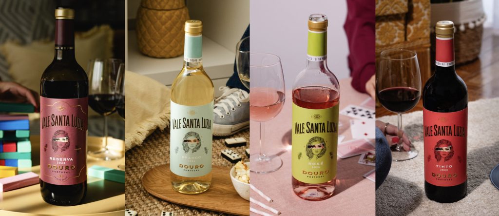
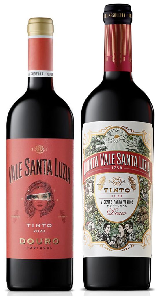
Thus was born Vale Santa Luzia, a youthful, vibrant line extension. We retained the brand’s core DNA—the eye symbol of Santa Luzia, the celebration of the “brilliant side,” and the promise of light and positivity—but gave it a fresh, irreverent twist. The label features a stylized portrait with a light band or “scratch” across the eyes, a semiotic wink to vision, curiosity, and revelation. Its bold yet harmonious palettes, minimalist layout, and modern typography make it immediately approachable and welcoming with energy. It doesn’t just look “affordable”—it looks alive, personal, and designed for social enjoyment.
Today, Vale Santa Luzia is a complete family, with QVSL offering classic brilliance for elevated occasions and VSLdelivering youthful brilliance for casual, spontaneous moments. Together, they express a single brand promise – the celebration of greatness—through complementary visual languages and emotional cues. From heritage to vibrancy, from formality to fun, the Vale Santa Luzia brand family proves that a single story, told with clarity and creativity, can also inform a brand architecture across price points, audiences and occasions.