
In the previous article, we described how the Quevedo Port positioning was brought to life and expressed across its product range. This article focusses on the next step : building identity brand assets. Read here how Brand Reveal worked with Think Bold Studio to equip Quevedo with distinctive brand assets.
- A word about “Distinctive” Brand Assets
Brand Assets are the brand colours, images, words, logos, sounds or physical special features which are associated with a brand or a company. These assets need to be distinctive, i.e. they must help the brand to be noticed and to associated with these elements.
Nike’s swoosh is a good example. When we see it, we associate it with the brand name and the call to action “Just Do It”, even without the brand name. Even better, we also associate these elements with a wider set positive memories (sports, effort, performance, etc…).
Distinctive brand assets help drive noticeability, recognition and link with positive attributes and memories. The book “Building distinctive assets” by Jenni Romaniuk throws a well-documented light on this topic.
2. Building Quevedo Identity Assets
To build Quevedo identity assets we focussed on :
- Colours as these are strong distinctiveness drivers;
- The brand symbol to create recognition and
- The claim to transmit an emotional message.
In developing these assets, we ensured the elements were :
- Different vs. the competitive landscape;
- In line with the brand positioning and
- Easy to use in as many situations as possible.
The latter point is crucial because it will ensure the assets consistent and continuous exposure to the brand audience, and therefore helps drive association.
3. Colours to create meaningful stand out
Keeping in mind the above, we examined the Port wine players colours and noticed that dark tones are very common and sudbued. In contrast, Quevedo is about “celebrating friendship” and the product design bring to life this idea via colourful explorations.
We opted to work with the “Terracota” colour in combination with “cream white” for primary colours as these are warm and light. Dark blues are also part of the colour set for more premium situations.

4. A symbol to encapsulate the brand ethos
Quevedo does not have coat of arms or lineage. In fact, this gives the brand the freedom to choose its representation form. In this case, the “Natural Q” – i.e. the Quevedo name initial with young vine leaves – was hand drawn.

This symbol is an evolution from the original logotype, but expresses the brand bond with nature, the company move towards environmental friendly production methods and its young-at-heart state of mind.
5. The claim as an invitation
To complete the elements, we wanted to have a sentence that signifies the brand promise in a fun way, but also to reflect quality and continuity. Port wine brands often use foundation years and often lack an enduring claim. After much brainstorming, we felt that current words were either clumsy or boring. So we invented our word, just like friend have their secret names: Friendology Forever.

“Friendology”, or literally “science of friendship” is not a common word. It is the unlikely combination of the emotional idea of friendship with the rational side of knowledge through the “ology” suffix. That alone is strong to trigger positive associations and ideas.
“Forever” works nicely as it projects the brand both into the past and f. It also reminds of the marks lovers write on walls or the enduring nature of real friendship. Think of a friend you just met after ages, and “it felt like yesterday”…
With the colours, symbol and claim, Quevedo now has a new set of assets it can leverage.
6. Implementation = acid test
The real value of the work above lies in its ability to be used in many different situations. As we speak, Quevedo is rolling out these assets across a variety of brand expressions, ranging from its site, social media communication and point of sales material…
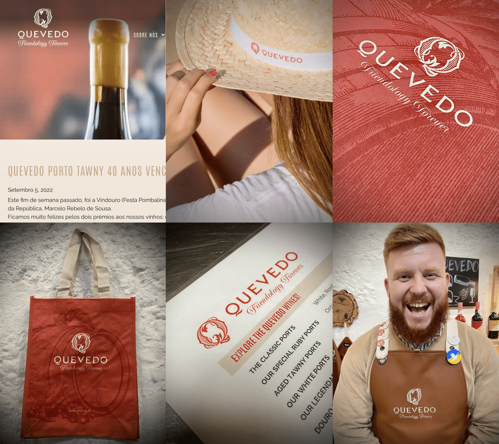
Quevedo is at the beginning of its journey under this fresh identity, but there is a nice consistency unravelling all across the board and already many positive reactions. All very promising for the future !