
In the previous articles , we described how the Quevedo positioning was brought to life through its packaging and identity. This paper outlines how Brand Reveal worked with the Think Bold Studio to tell Quevedo brand stories in a fresh way: infographics.
- THE CHARM OF INFOGRAPHICS
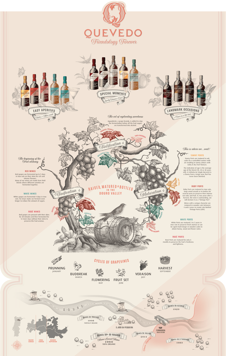
Infographics – or the art of sharing information with visual techniques – are very popular and come in countless forms. In fact, this way of sharing information has existed since the XIXth century, for instance in the form of department stores plans or geological maps. Today, with the help of computers, data visualization techniques help create stunning information representations.

Infographics embody the adage “a picture is worth a thousand words” as we are visual beings who want to easily grasp intricate ideas. Given the notorious complexity of Port wines, this category lends itself naturally to infographics that can be used to explain production process in an engaging way – rather than lining up technical terms or dates.
As Quevedo brand promise is about “Celebrating Friendship”, the colourful and visual language of infographics is a natural way to tell stories about the brand and its products. To tackle this project, we worked with Think Bold Studio to expand on the product universe tone and mood they developed for the brand range.
2. A RECIPE FOR GOOD INFOGRAPHICS
Before going to the drawing board, infographics require some organization in order to give the agency precise instructions to plan their work and find creative solutions. These include :
a) Information content and type
This part defines what kind of information will be shared. In the case of Quevedo, we wanted to show the journey of grapes from the estates right up to the bottles, but also how the different Port styles are produced, as well as a sense of location.
At this stage, we also defined how the information elements should be connected, as well as the amount of graphicor texts. This stage is rather labour intensive and requires a lot of information digging, structuring, drafting and corrections.
b) Uses and context
This part defines the uses of the forthcoming output. In this case, Quevedo wanted to make “the most of it”, i.e. not only a piece of work to be used in online platforms, but also :
- a visual reference to illustrate tastings for anyone;
- a ready to use base for posters and memorabilia;
- a frame to use for premises decorations such as murals or future stands;
- a pool of graphic elements to use in communications and Point Of Sales Material.
c) Style and tone
This part defines the graphic style of the work: as Quevedo new livery is a strong evolution from the previous incarnations, it was decided to expand on the same visual language than the bottles, i.e. warm colours and a multitude of line drawn fauna and flora.
Very quickly we favoured a rather light and neutral background to help the reading of information. To convey the brand natural feel and visual and drive focus, the new Quevedo symbol would be staged in the middle of the composition. And since this was all about origins and connections, the idea of connecting everything with a vine plant came naturally.
3) THE RESULT
As the work evolved, we first concentrated with the agency on the style and structure of the elements. Once we had a fair idea of how the whole work would look like, we went for the final execution with the actual drawings and fine tuning.
The result (in my humble opinion) is rich and welcoming. As often, we learned valuable lessons :
- Play with creative expressions and structured information;
- Guide the reader across information hierarchies and make room for hidden gems;
- Plan as much as possible to minimize changes and maximize the creatives added value;
- Get the right information bits for the same reasons above;
- Expand the brand existing assets, e.g. product labels. It is an endless source of ideas;
- Find your infographics story : here it was about from the “vineyards to your glass”;
- And… decide what to keep and what to discard as sometimes less is more.