
Everybody wants to be in RTDs. But is entering a booming category enough to succeed? In this three-part series, we challenge conventional RTD thinking, explore why so many propositions look alike, and show how to identify meaningful opportunities through consumer motivations rather than simply chasing trends or shelf space.
I- WHY SO MANY DIFFERENT PACKS FEEL FAMILIAR

Everybody seems to be jumping on the RTD bandwagon. It has a familiar feel. Craft. Gin. Hard seltzer. No/low… A category starts moving, innovation follows, new brands arrive, established brands extend — and suddenly everybody wants a piece of it. The result is an RTD JUNGLE.
More brands. More flavours. More formats. More colours. More claims. More design. For marketers, that creates a very practical problem: how do you avoid adding yet another can to an increasingly crowded and confusing landscape?
We recently took a close look at more than 200 RTD designs, including “pack deconstruction” and semiotic analysis (more on this on a next series). At first sight, the diversity is remarkable: minimalist cans next to fruit explosions; heritage brands next to irreverent newcomers; pastels, neons, illustrations, giant typography, cocktail cues, metallic finishes.
But look again and patterns start to emerge. RTDs look incredibly different. Yet many are saying the same things in remarkably similar ways.
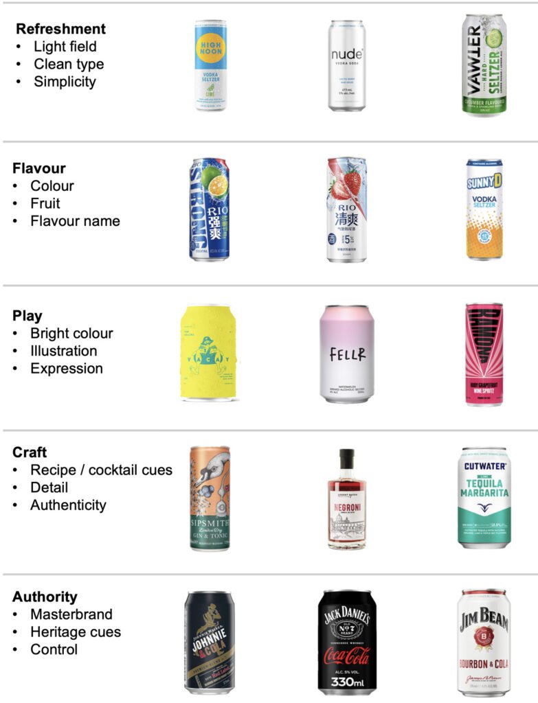
Take flavour. One can might be lemon yellow, another raspberry pink, another electric blue. Visually, they are very different. But underneath, they may be built from exactly the same formula: COLOUR + FRUIT + FLAVOUR NAME = TASTE ME.
The same happens elsewhere. Emply surfaces and clean sans serif typography may look contemporary, but they are also established signals of lightness and refreshment. Recipe details and provenance cues quickly communicate craft. Dark fields and metallic finishes can signal intensity or authority.
Put differently, RTD has an enormous visual vocabulary, but a surprisingly limited grammar. That’s not necessarily a problem. These formulas exist because they work. They give consumers shortcuts: this will be refreshing; this will be fruity; this feels crafted; this looks fun. Category codes help people understand what they are looking at.
The risk is using the language without realising you’re speaking it. A perfectly sensible brief — make it fresh, make the flavour obvious, make it contemporary, make it fun — can lead straight to something we’ve already seen many times before.
So navigating the RTD jungle starts with learning to see what sits underneath the apparent diversity: the formulas, the codes and the visual shortcuts.
Not necessarily to avoid them. But to know which ones you’re using — and why. Because that raises the next question: What happens when everybody starts using the same tricks to look different?
II- WHEN STANDING OUT BECOMES A DESIGN CLICHÉ
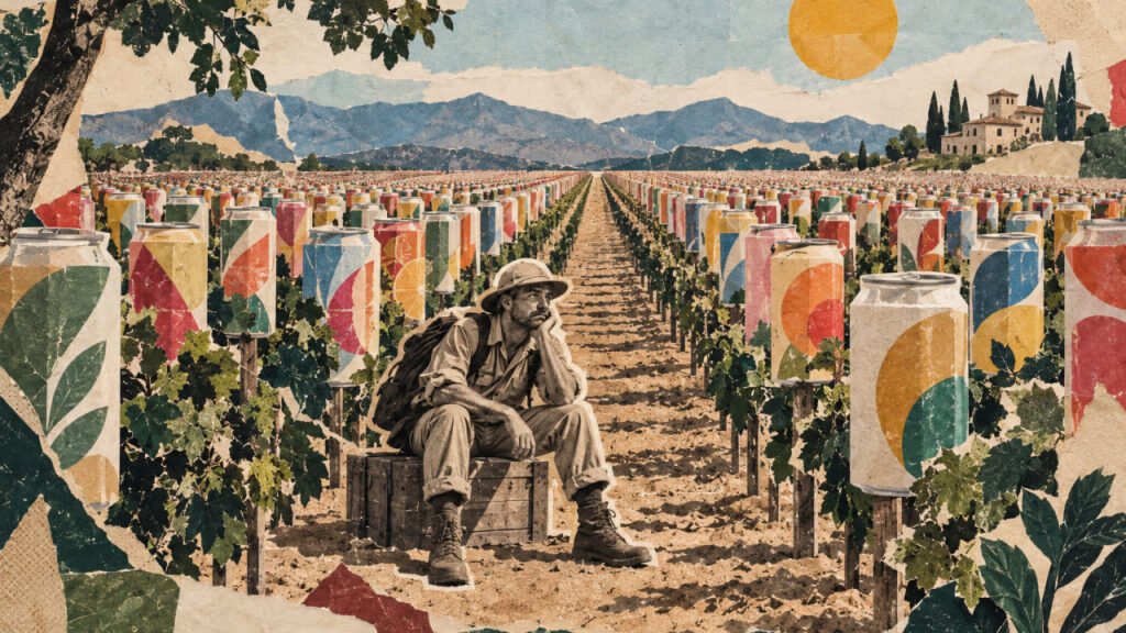
You’ve spent weeks with the design team. The new pack finally feels right. Bold. Fresh. Different. Everyone is excited. Then somebody drops a competitor launch into the WhatsApp group. Silence.
They’ve done something disturbingly similar. Nobody copied anybody. The projects probably happened at the same time. But suddenly everyone is half disappointed, half worried. Are we too close? Who got there first? Do we need to change ours? It happens more often than marketers and designers like to admit.
And there is a reason. In the first article in this series, we looked at the recurring visual formulas underneath the RTD jungle: familiar combinations of codes used to communicate refreshment, flavour, play, craft or authority.
But there is another layer to the problem. Brands don’t only share the same category codes. They often reach for the same devices to escape them.
Take oversized typography. It is a powerful design device: immediate, confident and highly visible. Put the brand across the whole can and it certainly gets noticed. But put a group of big-type RTDs next to each other and something slightly absurd happens: The thing making each one look different becomes the thing they all have in common.
DIFFERENT BRANDS. SAME TRICK.
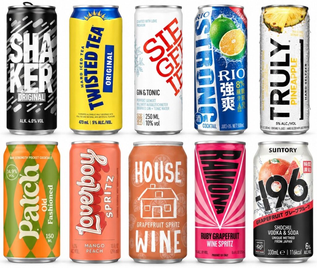
Big type is only an example. The same can happen with saturated colour, irreverent illustration, minimalism, exposed aluminium, unexpected cropping or deliberately disruptive layouts. None of these devices is inherently generic. And none is inherently distinctive. They are simply devices. This points to an important distinction:
ATTENTION = NOTICE ME DISTINCTIVENESS = RECOGNISE ME
A pack can be extremely good at the first and surprisingly weak at the second. So the answer isn’t an endless search for the next design trick nobody has used before. That trick probably exists somewhere already — and if it works, others will use it too.
The more interesting challenge is to create a recognisable combination of elements that starts to belong to the brand: Typography. Geometry. Colour behaviour. Composition. Imagery. Material. Attitude.
Individually, these are available to everyone. But consistently combined, they can create something much harder to confuse with the neighbour. That is where a design device starts becoming a distinctive brand system.
There is a simple — and rather brutal — way to test it:
Remove the logo. What remains that could still only be you?
If the answer is not much, the design may still be beautiful. It may be bold. It may stop people on the shelf. But it probably isn’t very ownable. And in an increasingly crowded RTD jungle, perhaps the distinctiveness imperative is not about trying harder to look different. It is about becoming easier to recognise.
III- FIND YOUR SPACE IN THE RTD JUNGLE
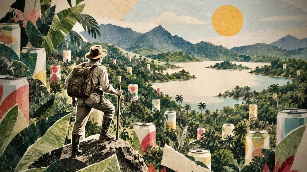
In the first section, we found that beneath the apparent diversity of RTD design sit a surprisingly small number of recurring visual formulas. In the second, we found another problem: even the devices brands use to stand out — big type, illustration, colour, minimalism — are available to everybody. A distinctive design isn’t necessarily a distinctive brand.
We know why so many RTDs end up looking familiar. We know why trying harder to look different doesn’t necessarily solve it. All very well.
But you still need to design the pack.
So where do you go? Broadly, there are 2 options.
A – You can compete better in an existing space. Perhaps refreshment, flavour or sociability is exactly where your brand belongs. You can use familiar category codes — but execute them better and build a more recognisable combination of assets.
B – Or you can look for white space: somewhere relevant to consumers that your brand can credibly occupy and competitors don’t already strongly own… unless you have a structural cost or distribution advantage and deliberately choose to follow. That’s a different game.
For brands looking to build value through differentiation, finding white space matters. But white space doesn’t necessarily mean finding something nobody has ever done. Sometimes the opportunity comes from challenging the way the category habitually expresses something consumers already want.
We explored three examples with concept boards and packcepts (not design intentions).
SOCIAL CONNECTION → CULTIVATED PLAY: RTD sociability often means youthful exuberance: bright colours, noise, irreverence, visual excess. But social pleasure can be adult, witty and spontaneous too. Cultivated Play uses character, unexpected colour, visual interruption, eccentric detail and controlled irreverence to create a world you want to join.
SENSORY EXPERIENCE → RESTRAINED SENSORIALITY: Flavour is frequently made visible through fruit, ingredients and explicit taste cues. But desire can also come from anticipation. Restrained Sensoriality uses liquid, texture, condensation, light, close-ups and physical sensation to make taste almost tangible — without simply showing you what’s inside.
CONSIDERED CHOICE → CONTEMPORARY AUTHORITY: Authority in drinks often comes dressed in heritage, dark colours, gold, signatures and conventional premium codes. But confidence can come from competence rather than status. Contemporary Authority uses precision, hierarchy, purposeful materials, expert behaviour and ordered graphic systems to say: whoever did this knows what they’re doing.
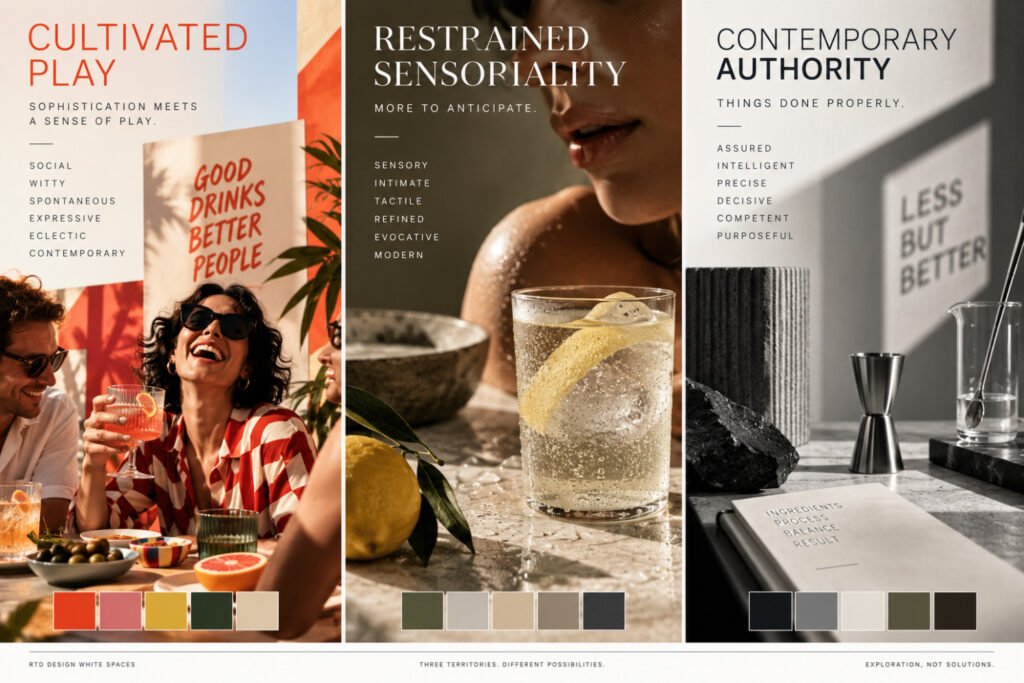
The point of a moodboard is to define the world before designing the pack: its people, occasions, environments, objects, colours, imagery, typography and materials.
But moodboards are still hypotheses. So we pushed the exercise one step further with 3 speculative examples. We took the same fictitious RTD proposition and expressed it through each territory. Product, flavour, format and information remained constant. Only the design territory changed.
The result is design probes, not brands – a way of testing whether each white space can actually generate a recognisably different design language. And that is the more useful lesson.
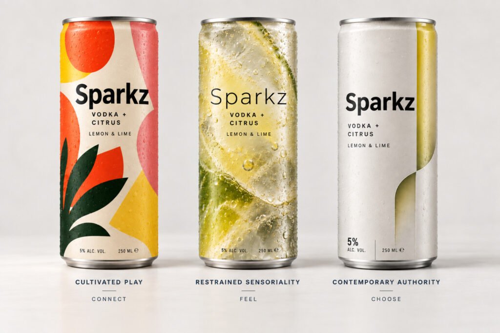
The exercise shows how understanding category conventions can reveal new places to play. Social connection can become more cultivated. Sensory appeal can become more evocative. Authority can become more contemporary. Connecting what people want from RTDs with fresh ways of expressing it opens new design spaces.
And as the Sparkz(*) exercise shows, those spaces can translate into materially different and potentially ownable design languages. So the starting question changes. How can we make this pack look different? becomes:
Where can this brand be meaningfully different?
Find the space. Define the codes. Make it yours.
Brand Reveal + Megusta are a network of drinks specialists, taking brands from strategy to design. Get in touch to find out more. Think Smart, Design Beautiful.
(*) Sparkz is a fictitious name used solely for illustration; any resemblance to an existing brand or trademark is coincidental.